The daily life of a modern person has smoothly flowed into a small device. Today we increasingly use smartphones to communicate with friends, listen to music and watch videos, read books, order food and tickets, solve financial issues, etc. For companies, it means an excellent opportunity to effectively communicate with the audience through a mobile app. It can be easily handled by in-app messaging, through which you can convey an attractive offer and create a positive experience for the user when interacting with the product. In this article, we are going to take a closer look at app messaging. We will share the secrets of how it can help your app stand out from the competition and win the attention of users.
What is in-app messaging?
When it comes to mobile app notifications, most people think of alerts that appear on the smartphone screen even when the app is closed. Such messages are called mobile push notifications. Typically, the user is prompted for permission to send these notifications during the app installation. Unlike mobile push, an in-app message does not require additional consent to be sent. Therefore, app messages are notifications displayed to your users when they are active in your mobile app.
Types of In-App Messages
According to the placement on the screen, in-app messages can be full-page, central, bottom, and top.
Whereas some types of app messaging are useful for increasing brand loyalty and obtaining extra information about the user, others are targeted specifically at the purchase. Notifications in the centre of the screen are typically most popular because they are more likely to prompt immediate action. However, everything depends on your marketing goals. Full-page in-app messages can be extremely effective if they are visually appealing. After all, this is exactly what consumers look at when choosing apps.
According to the type of information conveyed, an in-app message can be transactional or non-transactional. Transactional messages are related to the app itself as well as its interface and functionality. They inform users about how to use the app and how to get the most out of its features. Non-transactional messages are related to everything else, including special offers and announcements of new features.
Benefits of App Messaging
App messaging is not suitable for waking up an inactive audience, but it will help to establish a connection with the existing audience and thus improve user retention and engagement. Here are the key benefits of app messaging:
- Reaching the entire app audience. Unlike push notifications, in-app messages are part of the user experience. They don’t require an opt-in and can reach out to most of your audience.
- High personalization. In-app messages can be highly targeted. Besides content, you can personalize the link destination with the deep linking technology that enables you to assign a destination anywhere in your app.
- Easy to create. Similar to push notifications, in-app messages can be very simple to create. No matter the format, they provide marketing and content teams with an easy way to communicate key news without the need to update the code.
How to Use In-App Messaging
Often the right in-app messaging combines a competent marketing strategy and a strong UX. The messages should be interesting for the recipient and at the same time not interrupt the interaction with the app. According to a study by Reckless, in-app messaging has a 75% open rate. That’s over 45 times higher than email marketing and nearly three times higher than push notifications.
Let’s look at the use cases of app messaging as well as real examples of how brands manage to communicate directly in the app, and how this can affect retention.
Greeting
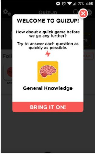
In UX, there is the FTUE (First Time User Experience) indicator, which determines the user’s first impression of interacting with the app interface. It is often a deciding factor of whether the user will continue to use the app. In this regard, already during the first session, it is necessary to interest the user in further acquaintance with the app as well as make all actions convenient and understandable for them.
A simple welcome message, animation, or GIF can make the difference. It draws the user’s attention to the newly installed app, increasing the app’s chances to survive the critical first 72 hours and avoid deletion. Thank your user for the download, reinforce the reasons why they downloaded your app, or incentivize the active use of the app with a reward. By expressing appreciation and creating an early connection that goes beyond just the download, you can retain the user.
App tour
Make sure that your users know how to properly use your app and its features. Even if you’re convinced that your app is intuitive, don’t forgo a walkthrough. If your app requires more cognitive effort than the user expects, there’s a good chance it will end up in the digital trash. According to a survey by Wyzowl, 80% of users say they’ve deleted an app because they didn’t know how to use it.
Offer an app onboarding tour that you can integrate into your welcome message or that users can activate after the welcome. App tours explain the functionality and encourage proper usage. Be sure to describe all features systematically and give your user an option to exit the tour at any time to begin using the app. Getting familiar with your app at the very beginning will improve the user experience and extend the life of your app. Here’s a good example of an app walkthrough by MyFitnessPal:

Gamification
In the gaming industry, the interaction cycle is often based on the “objective, challenge, reward (OCR)” model that encourages you to play the game stage by stage. The motivation of the players is divided into short, medium, and long-term: get to the treasure chest, level up the character, and complete the game. At each stage, the interest is fueled by a reward or new opportunities that the player receives for completing the task.
The reward system as a tool for user engagement and retention has become an integral part of many mobile apps. Rewards, ratings, progress bars, and just emotionally coloured positive messages penetrate the user’s mind and keep them motivated on the way to the goal. Having received even short satisfaction from praise for an achievement, the human brain forms a positive association of interaction with the product and encourages the person to return to it again.
The Focus Plant app is designed to increase personal productivity by reducing gadget dependency. To focus on an important matter, you need to turn on the timer and not use your smartphone for a certain time. To fulfil the condition, you get the sun and water that are needed to grow plants. The more time you spend without accessing apps, the more opportunities you have to grow a huge garden.

In-app messaging with rewards is relevant not only for apps that use game mechanics. Praise the user for their good taste, congratulate them on their anniversary order, or simply thank them for being with you. Knowing the portrait of your client, you can definitely find the right reason for a pleasant message.
Notification about updates and integration with other apps
If automatic app updates are active on the device, the user may encounter unusual elements on a new start or, conversely, not notice new useful features. Share important updates so that the user can take full advantage of them:
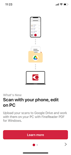
Regardless of whether the user is new, the right use of your app will add value. That’s why you should continually notify your users about new features and updates. This demonstrates your ongoing investment in the user experience and keeps your users informed. Direct users to your new features via a “What’s New” call-to-action and explain how they work. Additionally, you can alert them about important campaigns, such as free shipping offers or seasonal promotions.
Inviting friends
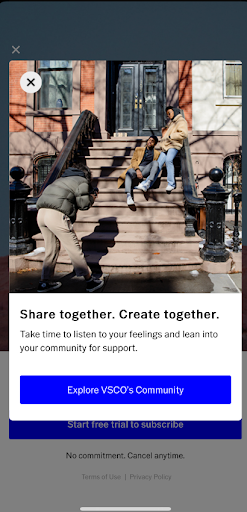
The natural growth of users through the recommendations of existing ones is one of the best methods of attracting a new audience for any business. First, it means low user acquisition cost. Secondly, a new client moves faster through the funnel, because they have already received a recommendation from a trusted source. That is why the practice of inviting a user’s friends is popular, for example, through an offer to share content or referral marketing.
On the other hand, if the user has an audience for interesting interactions in the app, this can extend their average customer lifetime through social engagement. Invite the user to build their own online community or add friends from social media, emphasizing in the in-app message the reason why it will be useful to them:
Upgrade from freemium to premium
In most cases, a company’s profit grows not by attracting new customers, but by repeating the purchases of existing ones. Naturally, apps that have paid and free plans tend to increase the number of subscription users. In this case, companies are trying to achieve what they want through in-app messages, but the outcome can be very different depending on the chosen strategy.
- Way one: give a short free period, and then block most important functions; send lots of annoying notifications about connecting a subscription every time the user enters the app or during a session.
- Way two: provide partial access to the benefits of a premium plan, and then use hints to gently push the user to the transition.
First of all, during the trial, not everyone has time to evaluate all of the functionality, especially if this period is 3-5 days. In the plan comparison messages, some of the benefits may not seem important enough to justify skipping the free version. Therefore, users should realize that they would like to increase their tariff plan on their own.
For example, the VSCO app allows you to apply a premium photo filter and evaluate the result. First, the user receives real value, and only then do they get a message with an offer to subscribe.
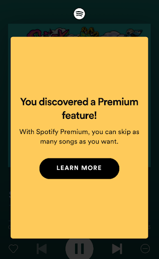
At the same time, the use of premium features should not become a surprise. If they do not have some kind of distinguishing mark, in-app notifications will come in handy. For example, the freemium version of the Spotify app allows you to switch 6 songs per hour, and when approaching the limit, the user receives a small hint about the limit. This reduces the possible negative if the user is ignorant and gives them the right to choose whether to continue using it with restrictions or switch to premium. The subscription offer appears after the user runs out of available track switches.
User interface customization
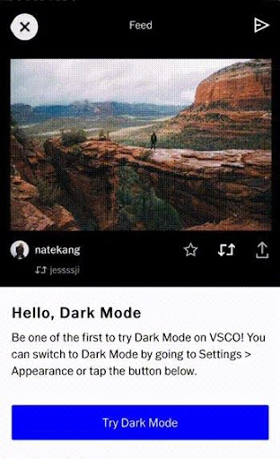
Analysis of user behaviour patterns, experienced UX/UI designers, A/B testing – how to create the perfect interface that absolutely everyone will like? The answer is obvious – no way. Even if the app rating and user reviews indicate that the majority are quite satisfied with the product, there will be those who think that it could be better. With in-app messaging, you can offer the user to customize the interface for themselves, earning additional loyalty points.
When presenting the release of the dark mode, the VSCO photo and video editor not only offers to try a new feature but also demonstrates how it will look like:
Asking for feedback
Real user reviews are the best opportunity to identify growth points and work on bugs. In addition, a request for feedback turns in-app messages from a company monologue into a dialogue. You will learn the user’s opinion and show that their satisfaction is important to you. Ask the user about their experience not just while surfing in the app, but after performing some targeted action: making a purchase, downloading content, or completing a level. Some like to leave full reviews, while others don’t want to take the time to write comments. In this regard, it is worth using two types of messages. The first one is for a quick assessment, whereas the second one gives an opportunity to go to an app store and leave a detailed review.

Wrapping Up
The correct use of in-app messaging will help you pick up your users right after they download the app and optimize their user experience. Even if in-app messaging means extra work for you, it’s worth it! Mobile apps present a rare opportunity to interact with your users on a personal level and provide you with location data that you can use to optimize the user journey. Apps are uninstalled incredibly quickly, but through personalized in-app messaging, you’ll create a premium user experience and lower the abandonment rates.
